
phutagalung
Indonesia


We are looking to obtain the help of creative UX/UI designers to update the user experience (UX) and user interface design (UI) of two webpages from a WordPress theme:
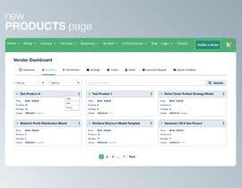
1) Products Page => attached as webarchive file
- show 1 row per product, no need to waste so much empty space
- There also needs to be a dropdwon list for quick product search/filter
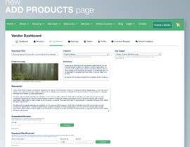
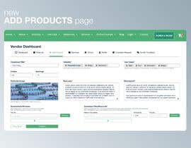
2) Add Product Page => attached as webarchive file
- The Industries and use cases on the Add Product Page need to be rearranged either in columns or in any other format to make them more user-friendly.
- Needs to have a modern design which encourages users to list their product
Please note:
- No need to change the header, only propose a design starting from Vendor Dashboard downward.
- Don't touch the footer
- Your design proposal should make use of our corporate colors (see attached) and be similar to an example design (see attached).
- You need to deliver design proposals for BOTH pages, not one page
- Deliverables: Upon selecting the best proposal, you will need to deliver the source files in PSD format.
Here some more guidance:
Product List Page (#10):
- Column headers (in grey). Try to come up with a modern design
- Green status dot for each product needs to come on the left of the product names (as product names will have different widths)
- Apart from Purchases, there should also be an Earnings column inserted
- Show also example products with status “Draft” and “Pending”. Use different Font colors (Green, Red, …) for these statuses
Add Product Page (#11):
- The title is not a Dropdown, its an input field
- Try to reduce the empty white space in your designs, it needs to be a bit more condensed, otherwise, it looks like a hug page
- Reduce the size of featured image field
- The industry is not a dropdown field, vendors can select multiple categories
- Summary and Description should have enlargeable field sizes => put a triangle symbol bottom right
- Make sure all buttons are properly aligned
- Uses Cases are badly placed, should be placed after industry selector. Also use cases allow for multiple option selection, not a dropdown list
- On the top of the page, you should also add Earnings and Orders of this product somewhere
“Creative designer. Very good work!”
![]() invalt, Switzerland.
invalt, Switzerland.


Legg ut din konkurranse Raskt og enkelt

Få mange bidrag Fra hele verden

Kår det beste bidraget Last ned filene - Enkelt!
