Logo design

  • Status: Closed
  • Premie: $150
  • Mottatte bidrag: 32
  • Vinner: taseenabc

Konkurransesammendrag

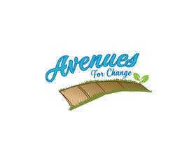
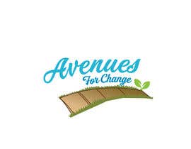
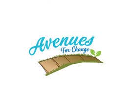
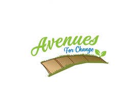
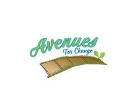
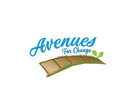
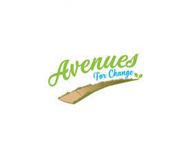
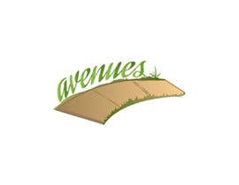
We really like the idea of a sidewalk or path as part of our logo, no icons with people in them. We'd like a logo that is earthy and warm. We want our practice to look friendly and welcoming, almost playful. We do not want a heavy or corporate looking logo. We serve men, women and children of various economic and educational backgrounds.

We are a group of independent therapists joined to support people in finding hope and resilience in the face of life’s obstacles. We are committed to supporting people in finding solutions to dealing with life’s challenges, regardless of their ability to pay.

Our name is Avenues for Change. We are thinking of blue and green tones for our logo, maybe a light tan?

Anbefalte ferdigheter

Arbeidsgivers tilbakemelding

“Apu was creative, polite, prompt, patient and professional throughout the process!”

Profilbilde ckellyks, United States.

Beste bidrag i denne konkurransen

Se flere innlegg

Offentlig avklaringstavle

  • ckellyks
    Konkurranseholder
    • 5 år siden

    The fonts are bold and corporate. We need a softer, friendly look - that will welcome men and women.

    • 5 år siden
    1. salimbargam
      salimbargam
      • 5 år siden

      you will just spend your money

      • 5 år siden
  • ckellyks
    Konkurranseholder
    • 5 år siden

    We are looking for a friendly, welcoming logo. Not business looking. The word “Avenues” means walkway to us- resembles life’s journey. We’d like some kind of a path. No people on it.

    • 5 år siden
  • bambi90design
    bambi90design
    • 5 år siden

    #360

    • 5 år siden
  • spaceidea00
    spaceidea00
    • 5 år siden

    Sir, Please check #201 #202 & #204.Thank you

    • 5 år siden
  • shakil71222
    shakil71222
    • 5 år siden

    Hello Sir, Please Check #194, #195

    • 5 år siden
  • Markmendoza12
    Markmendoza12
    • 5 år siden

    Please check #183 thank you

    • 5 år siden
  • searchfreelance
    searchfreelance
    • 5 år siden

    #135 check

    • 5 år siden
  • ckellyks
    Konkurranseholder
    • 5 år siden

    If the letters could be a little softer, not so blocky, and while we like the “hands” in the logo it may inadvertently communicate we think we have that kind of power in peoples’ lives. We like the idea of journeying alongside on a path as they grow.

    • 5 år siden
    1. johnnydepp0069
      johnnydepp0069
      • 5 år siden

      Please check #160 #161 entry

      • 5 år siden
  • petertimeadesign
    petertimeadesign
    • 5 år siden

    #guaranteed

    • 5 år siden
  • herobdx
    herobdx
    • 5 år siden

    #guaranteed

    • 5 år siden

Vis flere kommentarer

Hvordan å komme i gang med konkurranser

  • Legg ut din konkurransen

    Legg ut din konkurranse Raskt og enkelt

  • Få mange bidrag

    Få mange bidrag Fra hele verden

  • Kår det beste bidraget

    Kår det beste bidraget Last ned filene - Enkelt!

Legg ut en konkurranse nå eller bli med i dag!