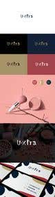
Hi Oksana, can you please make the "U" a little bigger like your original entry and make the "tra" a little finer as they look a bit too thick compared to the "x" also can you change the "a" and remove the curve at the top? Also I'd like to see some more colour options. If I pick you are you able to fine tune the design once the competition is finished if you win? I need the logo for a compact mirror which the casing is black. Can you show me what the logo or "U" symbol would look like on a black background? I'm sorry for all the questions, this is my first time using Freelancer and I'm just learning how it all works. Your design is my favourite and has been from the beginning :) Thak you for all your effort, Emma