Frilanser: lubinlouis
Del:
Rapporter innlegg

Paint Can Label

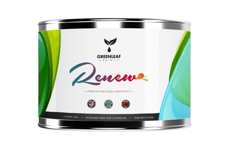
I've come up with a cleaner and glossy treatment for the graphic. The text "Renew" has been designed with a refreshing combination of colors, with a spill from the end. Please look at the second image to get a clear and magnified view of all the elements. Let me know what you think. Cheers!
Konkurransebidrag #88 i                                                 Design for paint can label

Offentlig avklaringstavle

  • emique
    Konkurranseholder
    • 10 år siden

    I like the design but the "renew" font is way too big, and although I like the blue and green waves on both sides, it does not leave room for words on the backside of the can label.

    • 10 år siden
    1. emique
      Konkurranseholder
      • 10 år siden

      Can you try both options on the back for me to see, it dosnt have to be perfect, i just have to visualize what youre trying to do. Also, the proportions of the paint can you have are not really correct. I really like your idea and would like to see if we can work on getting it done.

      • 10 år siden
    2. lubinlouis
      lubinlouis
      • 10 år siden

      Hello, Thanks for your response. I have updated the creatives as entry no. #92 , Please find the enclosed versions for the backside as well. I have also reduced the size of the word "Renew", and has increased the height of the paint can to some extent. I could work on the accurate dimensions, once you finalize and give me the measurements of the can. Please let me know if you have any feedback. Cheers!

      • 10 år siden