what you are looking for
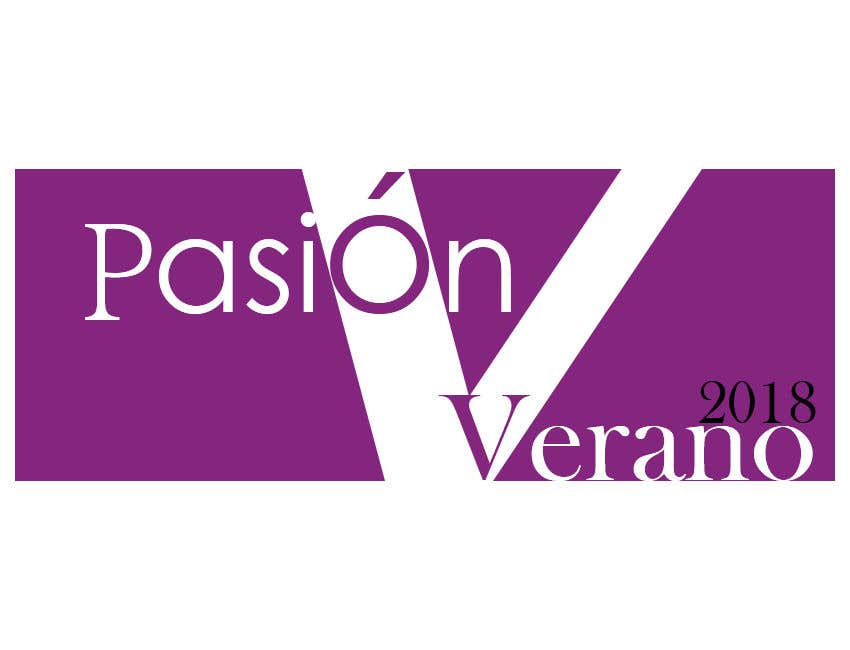
It's been complicated to create a design that isn't a rip off of someone else's hard work. but I pulled through like always. when I was putting this together my aim was to make something the contest holder wants and at the same time make it look as attractive and minimal as possible, with a combination of two lines of different thickness it gives the shape of a ''V'' to match Verano but while still having a second "v" within the lines to mimic a common fashion trend typically found on the covers of top magazines. For the word "Pasión" as it passes through the thickest line, the "ó" is made bigger to draw attention to the words and blend in with the line and the effect of this along with the ''V'' works hand in hand to create an artistic blend sure to perfectly fit in it's new environment.


