KENT GUITAR SCHOOL LOGO
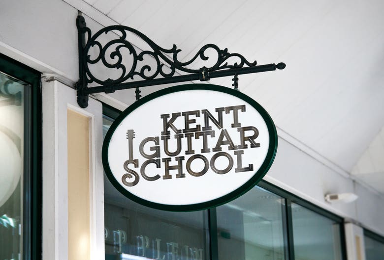
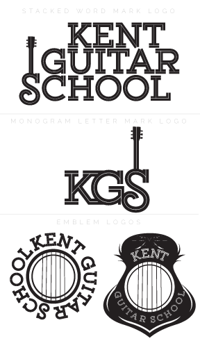
To begin I did a typographic study to see which typefaces best represented their professional and exciting brand in a happy and inspired way. I settled on an inline slab serif font that was mostly modern with some vintage contextual swashes to give it not only a guitar-like feel, but also bring in the abstract string elements in it’s form. With the words stacked, the letter “s” created a shape not unlike a guitar body, so I added a neck and head to make it stand out as suck. The same with done in the monogram letter mark with the addition of having the initials joined together. Finally I created 2 badge or emblem logo marks to be used on merch and other promotional items. The circle badge pulls in around a sound hole design with the guitar strings acting of the plosive lines of the word marks negative ones. Every school needs a crest, so I joined a shield shape with that of a guitar, and added a modified circle badge to the center to finish it off.


Om meg
▶ I am a graphic artist and illustrator with a music design niche. As a musician myself, I am specifically able to translate aural art into visual design. I have over 16 years of experience working for musicians, artists, bands, record companies & publications. I attended art school at DePaul University in Chicago, Illinois where I received a B. A. in Media Arts with a double emphasis in photography digital video. Likewise, I minored in communications with an emphasis in media studies. While in Chicago, I created web graphic design for the university library digital collection, mentored with Rolling Stones photographer Paul Natkin & freelanced for the Chicago Red Eye newspaper. After moving to New York City, I worked primarily in marketing, sales, promotion, social media, & design including as an artist-in-residence for the Antagonist Art movement & as a co-assistant manager at New York School of Rock. I like to think of myself as vintage/ lo-fi in style.