Simple logo for an Accommodation Centre for Children

  • Status: Closed
  • Premie: $40
  • Mottatte bidrag: 112

Konkurransesammendrag

I know there’s a lot of creative minds out there and I’ll reward mostly your creativity.
I feel deeply grateful in advance for all your work.
Just know that your effort will not be forgotten in this contest!

I want a simple and clean logo for a project I’ve been working on.

Basically, It’s an Accommodation Centre for Children from other countries that don’t have proper medical care to attend their needs in their home country.
Therefore, they have to move temporary to my country, Portugal, to receive it and they need a place to stay. That’s where this project born.
It’s a modest and simple house rebuilt and prepared to receive these children while they stay here, in Portugal. And sometimes it can be for a long time.

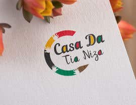
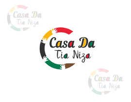
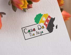
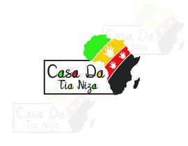
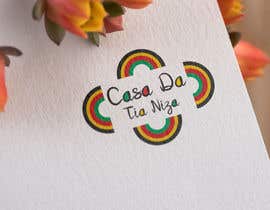
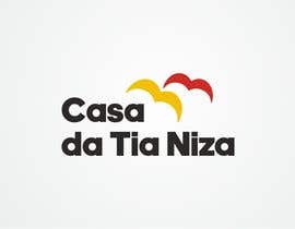
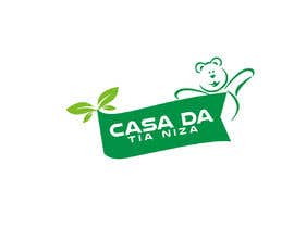
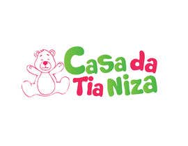
Name of the project: ‘’Casa da Tia Niza’’

Here’s the idea: Since the children we’re helping come from Africa, I would like you to use this colors: yellow, black, red and green (in order). I’ll put a file attached. Making sword of connection to this countries that speak Portuguese (it’s the colors of the community)
-
Once that is done let’s just take off all the teddy bears and childish clipart’s.
I like the idea of a house, but I don’t want an actual house image in the logo, or it will look like a construction company :/

Most importantly I want the logo to feel cozy and protective (since we’re protecting children) and it makes you feel welcome!

I'll leave in the files some logos that I like so that you can take ideas.

TIP #1: I really like the attached file (the second one, the logo alone), it has all the points, it makes the connection to this African countries, it's open like it's inviting someone, and it's simple. But I don't like the design.. it just feels old to me, I would like something more modern.

I’m open to your ideas and it doesn’t have to be too fancy.
Just keep it simple, and when I see something that I like I’ll take it!


Thanks again everyone. I hope to reward some of you for your effort very soon.
I’ll be available 24/7 (unless I’m sleeping), so reach me out if you have any questions.
Just know that by doing this you’re contributing for a social cause and you’re making a difference in the world!

Grateful!!

Anbefalte ferdigheter

Beste bidrag i denne konkurransen

Se flere innlegg

Offentlig avklaringstavle

  • sbmtiago
    Konkurranseholder
    • 5 år siden

    Hey guys! I must tell you I'm impressed with all your work! The contest is about to end and I love your designs. Specially those I rated most. You'll be picking a winner this week as I'll try to be as fast as possible. I truly appreciate all your effort as I feel deeply grateful for it! I hope to work with you again in the future!! Thanks everyone!

    • 5 år siden
    1. AmandaCPinheiro
      AmandaCPinheiro
      • 5 år siden

      Hi! I am sorry I just checked that my entries were uploaded with CYMK colors. I hope you consider mine as a darker green (South African flag color like). I would modified, but the contest is already closed :( #132 and #133

      • 5 år siden
  • webmobileappco
    webmobileappco
    • 5 år siden

    please check #127

    • 5 år siden
  • berragzakariae
    berragzakariae
    • 5 år siden

    Hi, Please check #119 thank you

    • 5 år siden
  • eexceptionalarif
    eexceptionalarif
    • 5 år siden

    My design is #103 , #104 , #105 , #106 . Thanks.

    • 5 år siden
    1. sbmtiago
      Konkurranseholder
      • 5 år siden

      Hey Ariful. I really appreciate your job! Unfortunately that is not what I was expecting. Please be sure to check to top rated to take new ideas and the comments so far.
      I'm grateful for your effort!

      • 5 år siden
    2. eexceptionalarif
      eexceptionalarif
      • 5 år siden

      Yes, Thank you sir. Please check #117 , #118 . Thanks.

      • 5 år siden
  • Alaedin
    Alaedin
    • 5 år siden

    Hello. I'm sorry to say this, but you are not clear with the instructions. First you said you like a teddy bear, and then you say you prefere the idea of a house. but not an actual house.
    You want the logo to look cozy and protective, but your description is headed towards something else. Anyhow it seems you already choose your top. Thanks for the opportunity. and good luck with your business.

    • 5 år siden
    1. sbmtiago
      Konkurranseholder
      • 5 år siden

      I really appreciate your feedback Alaedin A. and I'm sorry that things turn out to be this way. That is definitely something that I will work on. Wish you the best! Thank you for your effort!

      • 5 år siden
  • sbmtiago
    Konkurranseholder
    • 5 år siden

    Here’s the idea: Since the children we’re helping come from Africa, I would like you to use this colors: yellow, black, red and green (in order). I’ll put a file attached. Making sword of connection to this countries that speak Portuguese (it’s the colors of the community)
    -
    Once that is done let’s just take off all the teddy bears and childish clipart’s.
    I like the idea of a house, but I don’t want an actual house image in the logo, or it will look like a construction company :/

    Most importantly I want the logo to feel cozy and protective (since we’re protecting children) and it makes you feel welcome!

    Guys thank you so much! I really appreciate what you’re doing. And I’m seriously thinking about rewarding some of you for your effort if I get this right this time!

    • 5 år siden
  • sbmtiago
    Konkurranseholder
    • 5 år siden

    Hey everyone!
    I really appreciate all the work you’ve done so far. It’ incredible to have such talented people working on this project. I couldn’t be more grateful for that.

    I love the work you’ve done so far but here’s thing, I still don’t think I found what I was looking for. I just don’t ‘’feel it’’. And this upsets to me. I was thinking about this all day and it really makes me frustrated. But then, I had some new ideas, and I want to explore them!

    • 5 år siden
  • Seabit Media
    Seabit Media
    • 5 år siden

    Sorry mean #69

    • 5 år siden
  • Seabit Media
    Seabit Media
    • 5 år siden

    Please check #68 ,

    • 5 år siden
  • webmobileappco
    webmobileappco
    • 5 år siden

    please check #53

    • 5 år siden
  • sbmtiago
    Konkurranseholder
    • 5 år siden

    #41 I really appreciate your effort! I really do, but I don't like this design that much.
    However, I like the idea of the old lady, I didn't thought about that, and might fit well in the logo as well.

    • 5 år siden
  • ecomoglio
    ecomoglio
    • 5 år siden

    Hi, please check #41 . Thanks!!!

    • 5 år siden
  • sforid105
    sforid105
    • 5 år siden

    Dear sir, please check my entry #36 #37 #38 #39 thanks...

    • 5 år siden
  • sbmtiago
    Konkurranseholder
    • 5 år siden

    Guys I woke up this morning to these amazing designs and I must say that I'm very impressive.
    I never thought I had this much quality so early in the game!

    I like specially #21 and #16! They are very creative and it really impressed me. Love the ideas.

    For the ones I gave 1 star only, it's because it is not exactly what I was expecting for.
    I'm very grateful for your effort and I wish I could reward everyone for your time but that's not possible :/
    Feel free to leave the project if this is not your style or you have no more ideas.
    But if you feel you could help me don't hesitate in sending me your idea! I'll reward your effort and creativity after above all.

    Just a quick tip: If there's any part of the title that you increase the font size it would be ''Tia Niza'' because that's the actual name of the accommodation. ''Casa'' just means ''house'' in Portuguese which means ''Tia Niza's house''.

    Once again, thanks everyone! I should be back sooner!

    • 5 år siden
    1. sbmtiago
      Konkurranseholder
      • 5 år siden

      Aleadin A. Once again thank you so much for alert me. You seem like very professional guy and you know about this stuff. How I can I find in the web if it's a copy or not?

      • 5 år siden
    2. sbmtiago
      Konkurranseholder
      • 5 år siden

      I want to encourage you to come on board if you think you can help me with this!
      I'm a serious guy, I'm serious about this and this is a serious business. I'll do my best to award those who are original.

      • 5 år siden
  • Alaedin
    Alaedin
    • 5 år siden

    Since hard and original work is not considered, and copied cliparts are taking over, then I'll show myself the door. lol.
    Thanks anyhow.

    • 5 år siden
    1. sbmtiago
      Konkurranseholder
      • 5 år siden

      Alealdin A.
      Thanks for bringing awareness.
      I was not aware of that at all. I've never asked for a logo with cliparts like this in the past. How can I tell if it's copied or original? Is there any tip to overcome this problem?
      Because I want to reward creativity and originality, not copied stuff.

      • 5 år siden
  • Alaedin
    Alaedin
    • 5 år siden

    Copied from:
    https://happy-postcrossing.nl/en/kitsune-art/3584-kitsune-art-alphabet-j.html

    • 5 år siden
  • webmobileappco
    webmobileappco
    • 5 år siden

    please check #21

    • 5 år siden
  • sbmtiago
    Konkurranseholder
    • 5 år siden

    I uploaded a file with some Examples so that you can take ideas! Thanks everyone for your effort!!

    • 5 år siden

Vis flere kommentarer

Hvordan å komme i gang med konkurranser

  • Legg ut din konkurransen

    Legg ut din konkurranse Raskt og enkelt

  • Få mange bidrag

    Få mange bidrag Fra hele verden

  • Kår det beste bidraget

    Kår det beste bidraget Last ned filene - Enkelt!

Legg ut en konkurranse nå eller bli med i dag!