Logo + Package Design

  • Status: Closed
  • Premie: $100
  • Mottatte bidrag: 45
  • Vinner: veoenrico

Konkurransesammendrag

Our Business, PowerUp Gummies (PowerUps! For short) is needing a logo and 2 package designs (private label tag) for launch:

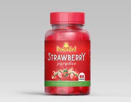
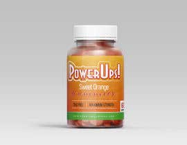
Dimensions for the packaging: 195x69

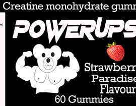
About Us: PowerUp Gummies is heavily inspired by powerups in video games, we aim to create that cartoon fantasy gummy, we also take inspiration by 'drinkprime' by Logan Paul and KSI, as well as a lot of gummy companies. PowerUp Gummies (PowerUps! For short) makes pre-workout and creatine monohydrate gummies,

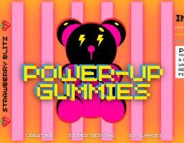
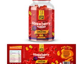
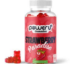
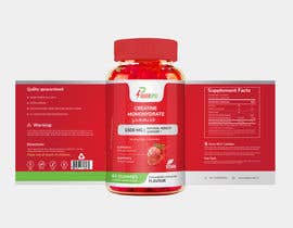
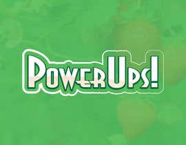
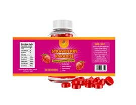
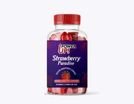
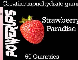
What we're looking for: We are looking for a unique logo using your imagination, either using the nickname 'PowerUps!' or, a muscular gummy, Show us your creativity and imagination, we want to stand out. We need packing for Creatine Monohydrate gummies 'Strawberry Paradise' (flavour) as well as Pre-workout gummies 'Sweet Orange' (flavour). Each unit also contains 60 gummies, 2 gummies is one serve. In the label, please include that it is not safe for children under 16 and pregnant people. We definitively want to promote our small calorie per serve/per gummy, we are gluten free and vegan friendly, low in sugar and carbs.

Nutritional Information:

Creatine Monohydrate: Please refer to the attached photo down below, those are the nutritional information for 2 gummies (per serve)

Pre-workout gummies:
calories 15
total carbohydrate 5g
sugar alcohols 5g
sodium 4mg
green tea extract 260mg
garcinia extract 250mg
raspberry ketone 250mg
green coffee bean 250mg Guarana Extract 40mg

Fun Fact: We are the first business in the world selling creatine gummies, and we like to think of our gummies as abilities, take a powerup and choose your ability

Website: powerupgummies.com

Below attached are photos of what the plastic bottle for packaging looks like as well as what the website is going to look like, use creativity to make us stand out! The caps in the plastic bottle can be any colour, however the bottle's will stay transparent and cant be changed. We have also included a barcode to be added onto the packaging.

***UPDATE
Below attached are more examples of energetic and big logos that make our brand stand out even more! Examples include "PRIME" as well as "GHOST", these logos/packaging stand out and thats what we want! If we could increase the name size and make the font similar to PRIME or GHOST, we can create that energetic feeling, some examples of what the name could be for the packaging or logo could be "POWERUPS!" or "POWERUP GUMMIES". Do please also add the flavour as well as what they are (Creatine monohydrate/Pre-workout). Show us your creativity! We want a cool, fun exciting design. Not a health store design!

Anbefalte ferdigheter

Arbeidsgivers tilbakemelding

“Amazing, Perfect”

Profilbilde PowerUpGummies, Australia.

Beste bidrag i denne konkurransen

Se flere innlegg

Offentlig avklaringstavle

  • iamonedesign
    iamonedesign
    • 1 Ã¥r siden

    IM NOT FOOLED BY THIS COINCIDENCE, VERY SUSPICIOUS THAT AN ENTRY WHO HAS JUST JOINED AND FROM THE SAME COUNTRY WINS!!!!!!! SO I WILL BE WATCHING!

    • 1 Ã¥r siden
    1. iamonedesign
      iamonedesign
      • 1 Ã¥r siden

      Withdraw it soon after, might as well release it.

      • 1 Ã¥r siden
    2. JonG247
      JonG247
      • 1 Ã¥r siden

      Understandable & very cool design, just a shame it wasn’t a proper contest

      • 1 Ã¥r siden
  • nkabir247
    nkabir247
    • 1 Ã¥r siden

    I am surprised. What a design! Congratulation. Sorry for Andrew F.

    • 1 Ã¥r siden
    1. iamonedesign
      iamonedesign
      • 1 Ã¥r siden

      We have no control over what the content holder preferred design is. What bothers me and find a little suspicious is the designer joined, entered and won all in a matter of a day, and is from the same country. Coincidence, not likely, seems to happen fairly regularly on this platform, usually the content holder is fishing for ideas most of the time.

      • 1 Ã¥r siden
    2. nkabir247
      nkabir247
      • 1 Ã¥r siden

      Yes, brother, I think so. this is a suspicious contest.

      • 1 Ã¥r siden
  • hamzamehenni
    hamzamehenni
    • 1 Ã¥r siden

    There is a lot of manipulation and pseudo-successful people on this platform, the number of these transactions is exaggerated

    • 1 Ã¥r siden
  • iamonedesign
    iamonedesign
    • 1 Ã¥r siden

    FAKE FAKE FAKE.

    • 1 Ã¥r siden
  • biswasshuvankar2
    biswasshuvankar2
    • 1 Ã¥r siden

    #87 scroll-down i am ready your work if give chance do more version , Thanks ..

    • 1 Ã¥r siden
  • biswasshuvankar2
    biswasshuvankar2
    • 1 Ã¥r siden

    give me some time

    • 1 Ã¥r siden
  • biswasshuvankar2
    biswasshuvankar2
    • 1 Ã¥r siden

    give 1 more soon i hope now you like it , Thanks

    • 1 Ã¥r siden
  • iamonedesign
    iamonedesign
    • 1 Ã¥r siden

    @PowerUpGummies Any thoughts on my comments? Message me!

    • 1 Ã¥r siden
  • JonG247
    JonG247
    • 1 Ã¥r siden

    Judging by your previous work congrats Andrew F.

    • 1 Ã¥r siden
    1. iamonedesign
      iamonedesign
      • 1 Ã¥r siden

      Not won yet, still plenty of time for new entries to take the crown. GL

      • 1 Ã¥r siden
  • nkabir247
    nkabir247
    • 1 Ã¥r siden

    Have a good day, Please check my entries #57 #59 #68 and #73

    • 1 Ã¥r siden
  • EdgarxTrejo
    EdgarxTrejo
    • 1 Ã¥r siden

    #78 Hi mate good day , hope you like the logo

    • 1 Ã¥r siden
  • Eraxe
    Eraxe
    • 1 Ã¥r siden

    Check #71 please. Thanks.

    • 1 Ã¥r siden
  • sportbig1
    sportbig1
    • 1 Ã¥r siden

    please check the entries #74 #77 . thank you

    • 1 Ã¥r siden
  • iamonedesign
    iamonedesign
    • 1 Ã¥r siden

    Content Holder - Working on a design, will be uploaded later today.

    • 1 Ã¥r siden
    1. iamonedesign
      iamonedesign
      • 1 Ã¥r siden

      Design has been created and uploaded, check out Entry #75 . Look forward to hearing back from you.

      • 1 Ã¥r siden
  • biswasshuvankar2
    biswasshuvankar2
    • 1 Ã¥r siden

    #70 scroll-down, update version

    • 1 Ã¥r siden
  • hamzamehenni
    hamzamehenni
    • 1 Ã¥r siden

    Please see #62

    • 1 Ã¥r siden
  • sportbig1
    sportbig1
    • 1 Ã¥r siden

    or the Entry #49 .Thank you

    • 1 Ã¥r siden
  • sportbig1
    sportbig1
    • 1 Ã¥r siden

    Check Please the Entry #48

    • 1 Ã¥r siden
  • sportbig1
    sportbig1
    • 1 Ã¥r siden

    please check the entry #44 .thank you

    • 1 Ã¥r siden
    1. PowerUpGummies
      Konkurranseholder
      • 1 Ã¥r siden

      Please refer to picture comment!

      • 1 Ã¥r siden
  • biswasshuvankar2
    biswasshuvankar2
    • 1 Ã¥r siden

    #43 check please

    • 1 Ã¥r siden
    1. PowerUpGummies
      Konkurranseholder
      • 1 Ã¥r siden

      Hi Shuvankar!

      Thank you for your entry and your package design/logo, we feel that this packaging leans to be more professional and minimalistic, we want our logo and packaging to stand out! Please refer to the examples given by other top entries or the attached images! Thank you!

      • 1 Ã¥r siden
  • YhanRoseGraphics
    YhanRoseGraphics
    • 1 Ã¥r siden

    Kindly please check my entry #37 Thanks a lot.

    • 1 Ã¥r siden
    1. PowerUpGummies
      Konkurranseholder
      • 1 Ã¥r siden

      Hi John,

      While you have successfully done updates on what we suggested, the muscular gummy in which you have provided does look very low quality as it was taken from images, we highly recommend creating your own muscular gummy and applying it!

      Thanks!

      • 1 Ã¥r siden
  • PowerUpGummies
    Konkurranseholder
    • 1 Ã¥r siden

    ***Please see details for an update!

    • 1 Ã¥r siden
  • sportbig1
    sportbig1
    • 1 Ã¥r siden

    Hey can you please check my entry #11 .Thank you

    • 1 Ã¥r siden
    1. PowerUpGummies
      Konkurranseholder
      • 1 Ã¥r siden

      Hi Abdelhadi!

      Amazing design and Logo, you are definitively on our top list!

      A few changes we do have in mind is potentially changing the font as the 'UP' doesn't really fit well, also potentially adding a muscle gummy bear to make it stand out more! With the thunderbolt through the O, we love that, that shows more energy, bring more creativity to it!

      • 1 Ã¥r siden
    2. sportbig1
      sportbig1
      • 1 Ã¥r siden

      Hi mate!
      i will i make this changes and i can modified the logo for fit it Thank you

      • 1 Ã¥r siden
  • wwitc
    wwitc
    • 1 Ã¥r siden

    Hello sir I am working on your packaging. Do you like this logo idea? please check #30 , thank you

    • 1 Ã¥r siden
    1. PowerUpGummies
      Konkurranseholder
      • 1 Ã¥r siden

      Hi Opu,

      We do feel that this logo is a bit basic and needs more life and energy! We want our logo to stand out! Please refer to the pictures attached and the website to understand !

      • 1 Ã¥r siden
  • biswasshuvankar2
    biswasshuvankar2
    • 1 Ã¥r siden

    #27

    • 1 Ã¥r siden
    1. PowerUpGummies
      Konkurranseholder
      • 1 Ã¥r siden

      Hi Shvankar,

      I understand that this is an old design, please show us a logo/design you have for powerups so we can discuss and differentiate, thank you!

      • 1 Ã¥r siden
  • Zacklan
    Zacklan
    • 1 Ã¥r siden

    #26 as you suggested
    What do you think?

    • 1 Ã¥r siden
    1. PowerUpGummies
      Konkurranseholder
      • 1 Ã¥r siden

      Hi Zakaria,

      The logo is great, however we do feel it is leaning towards a more professional side, we need our logo to be energetic!

      • 1 Ã¥r siden
  • SherifShe7ata
    SherifShe7ata
    • 1 Ã¥r siden

    please check #9

    • 1 Ã¥r siden
    1. PowerUpGummies
      Konkurranseholder
      • 1 Ã¥r siden

      Hi Sherif,

      We do feel like the logo is too professional and minimalistic, our brand is based of powerups in video games, and thus we want our logo and packaging to be energetic! Please refer to our website screenshot attached

      • 1 Ã¥r siden
  • SherifShe7ata
    SherifShe7ata
    • 1 Ã¥r siden

    please check #5

    • 1 Ã¥r siden
    1. PowerUpGummies
      Konkurranseholder
      • 1 Ã¥r siden

      Hi Sherif,

      We do feel like the logo is too professional and minimalistic, our brand is based of powerups in video games, and thus we want our logo and packaging to be energetic! Please refer to our website screenshot attached

      • 1 Ã¥r siden
  • Digipoint98
    Digipoint98
    • 1 Ã¥r siden

    #sealed #sealed #sealed #sealed #sealed #sealed #sealed #sealed #sealed

    • 1 Ã¥r siden

Vis flere kommentarer

Hvordan å komme i gang med konkurranser

  • Legg ut din konkurransen

    Legg ut din konkurranse Raskt og enkelt

  • FÃ¥ mange bidrag

    FÃ¥ mange bidrag Fra hele verden

  • KÃ¥r det beste bidraget

    KÃ¥r det beste bidraget Last ned filene - Enkelt!

Legg ut en konkurranse nå eller bli med i dag!