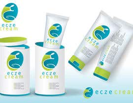
Logo Design for Eczecream
- Status: Closed
- Premie: $290
- Mottatte bidrag: 155
- Vinner: lukaslx

Konkurransesammendrag
Logo for Website and Product Packaging.
Anbefalte ferdigheter
Arbeidsgivers tilbakemelding
“My design contest had over 300 entries and we picked lukasix's logo. The design that lukasix entered was well thought out and had a great use of colors. I can tell he/she is a very talented graphic designer. ”
![]() kgbaron3, United States.
kgbaron3, United States.
Offentlig avklaringstavle
-

Konkurranseholder - 12 år siden
Thanks again to everyone that entered. Don't pay attention to your stars. When we did the final cuts, we either did 1 or 5's for sorting purposes. We are loading a new logo for "HealthTrafficker" today if you are interested in competing.
- 12 år siden
-

spontaneous
- 12 år siden
#298 plz check my last chance :(
- 12 år siden
-

awardwinner
- 12 år siden
Sure you copied something from Ponds
- 12 år siden
-
spontaneous
- 12 år siden
dont make me laugh, what is pond logo anyway?
- 12 år siden
-

designanswer
- 12 år siden
Yes, nice, congratulations to the winner and contest holder!
- 12 år siden
-

twindesigner
- 12 år siden
congratz to the winner ! very nice design ...:)
- 12 år siden
-
spontaneous
- 12 år siden
I was sure that will win, congrats anyway
- 12 år siden
-

pinky
- 12 år siden
Congrats to winner!!!!! Really Nice design:)
- 12 år siden
-

AkashSikh
- 12 år siden
hi
- 12 år siden
VIs 10 meldinger til
-
twindesigner
- 12 år siden
i know .. its like me 10 years older :))
- 12 år siden
-
pinky
- 12 år siden
Yes:) you can see how you will look like after 10 years...
- 12 år siden
-
Konkurranseholder - 12 år siden
I will be picking a winner today. Thanks to everyone that entered. New contest coming soon!
- 12 år siden
-

tiffont
- 12 år siden
just to get the opinion from the other designers in this contest, does #218 really deserve a 1 start
- 12 år siden
-

gilmarS
- 12 år siden
Congratulations to the winner, but actually the holder of the contest has a bad taste. It is my opinion. Anyone can copy this logo without creativity. Sorry.
- 12 år siden
-
AkashSikh
- 12 år siden
goodbye!
- 12 år siden
-

jagadeeshrk
- 12 år siden
and check #295
- 12 år siden
-

DesignersLead
- 12 år siden
#291 and onwards....
- 12 år siden
-
jagadeeshrk
- 12 år siden
pcheck #290
- 12 år siden
-

thekingmaker
- 12 år siden
Please see #256 #260 #285 #286. thanks
- 12 år siden
-
thekingmaker
- 12 år siden
#289 too
- 12 år siden
-

JWoyt
- 12 år siden
Hi there,
Would love feedback on #283 . I wanted to bring the two words together, make them stand out, but still have something iconic for packaging. Alternatively, the combined e and c can be used for a smaller logo :)- 12 år siden
-

cottarainen
- 12 år siden
Hello sir,please check 274.
Respect.- 12 år siden
-

lukaslx
- 12 år siden
#273 , check it
- 12 år siden
-
lukaslx
- 12 år siden
#196 , check it
- 12 år siden
-

Nandanbarnali
- 12 år siden
please check #271
- 12 år siden
-
alis95
- 12 år siden
Sir please check #261 , #259 . i think any of two is simple ,eye .....
- 12 år siden
-

pantonieta
- 12 år siden
And, just for you to know, the dots in the logo #200 represent the affected skin.
- 12 år siden
-
pantonieta
- 12 år siden
Say something about mine ( #200 ), please! Obrigada!
- 12 år siden
-
twindesigner
- 12 år siden
@BlueMoon i think our concepts look preety similar.... #134 #217 :)
- 12 år siden
-
AkashSikh
- 12 år siden
no i think bluemoons concept gives a soft touch! while your gives a men touch..
- 12 år siden
-
twindesigner
- 12 år siden
please check my new concept #252 thank you !
- 12 år siden
-
tiffont
- 12 år siden
#218 any feedback
- 12 år siden
-

wolf313
- 12 år siden
Check 185, i amde sure design is simple , and no complex colours, and text getting the most attention
- 12 år siden
-
tiffont
- 12 år siden
#183 thank you
- 12 år siden
-

eeshu
- 12 år siden
#166....................thanks
- 12 år siden
-

IQlogo
- 12 år siden
Check #165
- 12 år siden
-

ivandacanay
- 12 år siden
Please Check Artwork No. 162, Thanks
- 12 år siden
-
ivandacanay
- 12 år siden
sorry.. #162
- 12 år siden
-
spontaneous
- 12 år siden
#148
- 12 år siden
-

shakimirza
- 12 år siden
Check another one #144
- 12 år siden
-

sayeedgt
- 12 år siden
hey,#144 is mine,may be you mistook something.:P
- 12 år siden
-
sayeedgt
- 12 år siden
please see these two.#147,#144
- 12 år siden
-
shakimirza
- 12 år siden
Check another one #145
- 12 år siden
-
sayeedgt
- 12 år siden
thank you sir for rateing my design.check another one.#144.do you see any difference?
- 12 år siden
-
shakimirza
- 12 år siden
check my concept #139 #141 #142
- 12 år siden
Hvordan å komme i gang med konkurranser
-

Legg ut din konkurranse Raskt og enkelt
-

Få mange bidrag Fra hele verden
-

Kår det beste bidraget Last ned filene - Enkelt!