Design a Logo
- Status: Closed
- Premie: €70
- Mottatte bidrag: 2
- Vinner: marvinbaldemor36
Konkurransesammendrag
Hello,
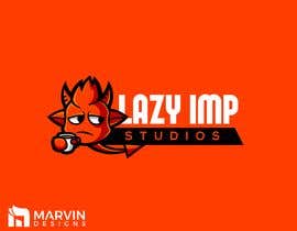
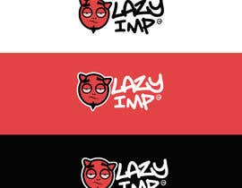
We’re an indie game development team called Lazy Imp and we require a logo matching our name.
Our vision is a simplistic (2-3 colors) 'Imp' looking shape. The imp should denote more or less a lazy/sleepy emotion.
Maybe a fat imp with a coffee leaning on the name, or a sleepy (but more towards laziness, mood less, without energy) face of an imp, doesn’t necessarily have to illustrate the whole body or any other position/situation which would portray these emotions.
IMPORTANT: Keep it simple, don’t make it very detailed, we want something that can be put on a card and still be intelligible.
We want a creative and clean logo. If you illustrate it on a company card/wall template, it would allow us to imagine your entry clearer.
Attached there will be examples of styles that may help you understand our vision; do not limit yourselves to the references, try to use them just for inspiration.
Please note that, while coming up with a good color combination from start may make an entry look better, the logo itself is still more important.
ATTENTION:
Do not use someone else’s work; your entries need to be made completely by yourselves.
The winner entry will have its rights and ownership transferred to us.
Anbefalte ferdigheter
Arbeidsgivers tilbakemelding
“Marvin did a good job for our company logo. He was very responsive and quick when it came to the changes that we wanted. Would work with him again. :)”
![]() LazyImp, Romania.
LazyImp, Romania.
Beste bidrag i denne konkurransen
-
Alinawannawork Ukraine
Offentlig avklaringstavle
Hvordan å komme i gang med konkurranser
-

Legg ut din konkurranse Raskt og enkelt
-

Få mange bidrag Fra hele verden
-

Kår det beste bidraget Last ned filene - Enkelt!


